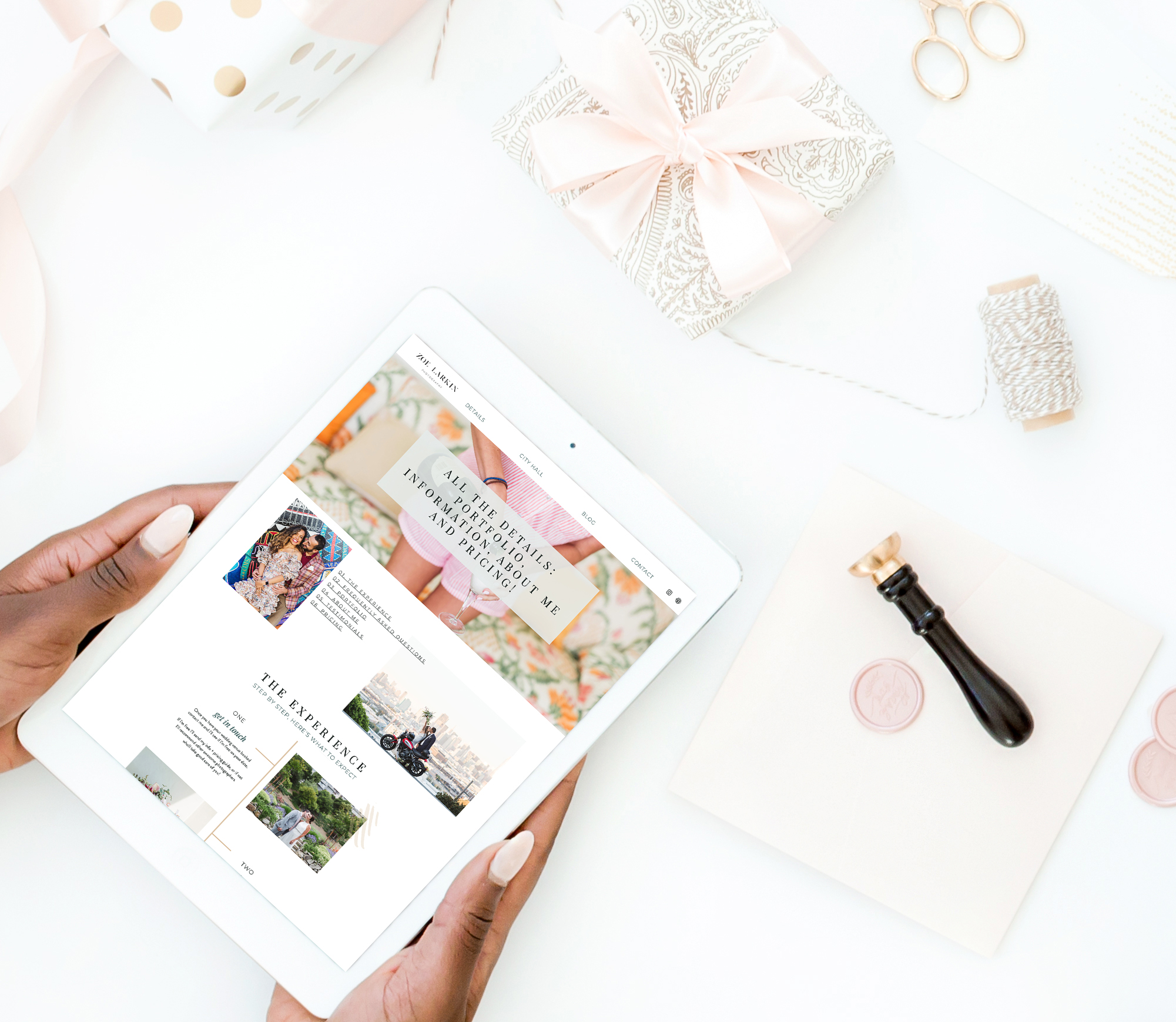
Ready to see a BOLD Showit template for photographers in action? I’m so excited to introduce you to the incredible photographer- Zoe Larkin! Zoe is a wedding photographer in the San Francisco area. She used the Olivia Showit template from EM Shop to create her beautiful website.
Want to know more about Showit and these website templates? They are a user-friendly, code-free starting place to getting your own little space on the internet. EM Shop's Showit templates are perfect for photographers like Zoe to create a place that is an online home for her business. I had the pleasure of meeting Zoe in real life at Showit's United Conference. It happens every year in Phoenix, and last year I got to hug Zoe in real life and chat about her website!


Hear from Zoe!
Why did you choose your particular template?
"I fell in love with the Olivia James template as soon as I saw it. It was the perfect blend of elegant & classy but then also modern without being too trendy. It had a very high-end look that conveys a specialized service and a high level of attention to detail. Just for a bit of background, my previous website was a WordPress one that I bought through a theme company and it was extremely simple and almost all white space - basically too minimal! Olivia had thoughtful design touches and subtle use of color."


What’s your favorite part of your website?
"My favorite part of my new website is my details page. I love the design on this page. I have used it to explain the process of what it's like working with me and I love how simple and elegant it looks."
How do you think this updated look will impact your business?
"This new website will eventually allow me to charge more for my services! It definitely conveys a MUCH higher-end business than my previous one, which clearly looked like a cheap WordPress theme. Being in a visual field such as wedding photography, the design is so important as it shows that I care about how my work is presented. Potential clients can see I've clearly gone above and beyond to create a beautiful visual experience that guides the client into what it would be like working with me. The new site also shows a particular specialism that's put front and center. Clients will feel more cared for and I'll be able to create dedicated resources just for their kind of wedding. My hope is that my clients will feel special and that is conveyed to a T through my new site."


What resource/tool was most helpful to you as you customized your website?
"Elizabeth's Showit Blueprint Course was all I needed to complete my site. I had used Showit's help resources too (as this was my second Showit website) but I actually understood it fully once I had watched her video series, rather than just clicking around and hoping for the best which was what I was doing pre-Elizabeth!!"
What are you personally most proud of about your new website?
"The cohesiveness of it as a whole! It's never 100% done, of course, but I love how every post and page conveys a high-end look and nothing looks out of place. This is the difference when you're using a professional designer like Elizabeth rather than trying to cobble something together myself like I'd been doing before! Also, the design possibilities are endless and can be customized if I ever did feel like I needed to make more additions or changes over time."


What would say to someone who is on the fence about buying a template from EM Shop?
"It's 100% worth it. This is my second Showit template (the first was a free one) and holy smokes, the difference using Elizabeth's was night and day. The curated (and customizable) color palette and thoughtful typeface choices are right there! Also, there are so many pages and canvases so you will definitely find starting points for all your content without having to design anything yourself. Elizabeth has done it ALL for you. Even if you currently don't have a clue about Showit, the video help is 100 times better than Showit's own help so you'll be able to learn as you go."


