Rebranding = the act of changing the corporate image of a company or organization. Aka: A 100% scary, intimidating endeavor.
Rebranding can feel overwhelming and often we aren’t sure if it’s even necessary. But, as your brand evolves and changes - your look and voice should too.
These billion dollar companies all looked quite different in their earliest days. So, nerd out with me for a moment and let’s take a look at the before and after’s for these iconic brands!


Apple
The first Apple logo looks a lot different than it does now. This super detailed logo was created in 1976 by Steve Jobs and Ronald Wayne. The drawing is of Isaac Newton sitting under an apple tree. In 1977, Apple hired designer Rob Janoff to simplify the design and focus on the apple itself. He did not disappoint! Although it’s been slightly refined over the ages, his design from 40 years ago is the iconic logo we know today.


Amazon
Long before Amazon was the #1 spot to buy virtually anything, it was an online bookstore. The original tagline was actually “Earth’s biggest bookstore.” In its early years, Amazon had a couple different logos that kind of look like an A with a road going through it. The logo makeover from 2000 that we know today is beyond genius. The arrow travels from A to Z representing that Amazon sells everything “from A to Z.” The design of the arrow also makes a smile!


Starbucks
The original Starbucks logo was the image of a “twin-tailed mermaid”, or siren. Over the years the logo has changed a lot, but the main logo element - the siren - still remains front and center. In 2011, for Starbucks 40th anniversary, the siren received yet another update and the word “Starbucks” was dropped completely from the logo.
(P.S. Starbucks former CEO and current Executive Chairman, Howard Schultz, was recently on How I Built This. It’s an amazing episode. Give it a listen!)


Pepsi
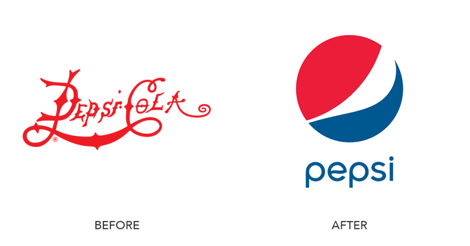
In 1898, Pepsi started with a scribbly logo script. Since then, the company has had over 10 different rebrands. On Pepsi’s 100 year anniversary, they unveiled a new modern, simplistic logo to symbolize the brand’s innovation and global recognition.


Originally, Facebook launched in 2003 as “FaceMash” and the site was closed down within a year. When they relaunched, it was called “The Facebook.” In 2005, “the” was dropped and a logo similar to what we see today was created! The Facebook logo has been modified slightly and frequently to get this logo that we recognize today!


Shell
In the early 1900s, the Shell logo was literally a scallop shell. In 1948, the logo added the yellow and red color we know today. The colored version was first used in California. The logo uses the colors of Spain, which helped the brand stand out amongst early California settlers, many of whom were from Spain. The 1971 logo (which is still used today) was created by the same designer who branded BP and Exxon!


eBay
EBay’s story is different than others on this list. They have only changed their logo ONCE. Yes, once, in 17 years. And, the logo isn’t even a total departure from the original. They kept the same colors but gave it a cleaner, more refreshed look. Also, just for fun… how crazy was the original eBay website homepage?! My, my websites have changed...


Take it from these companies, rebranding and modifying your look can be a really good thing! So tell me, what’s your favorite logo of the bunch?


