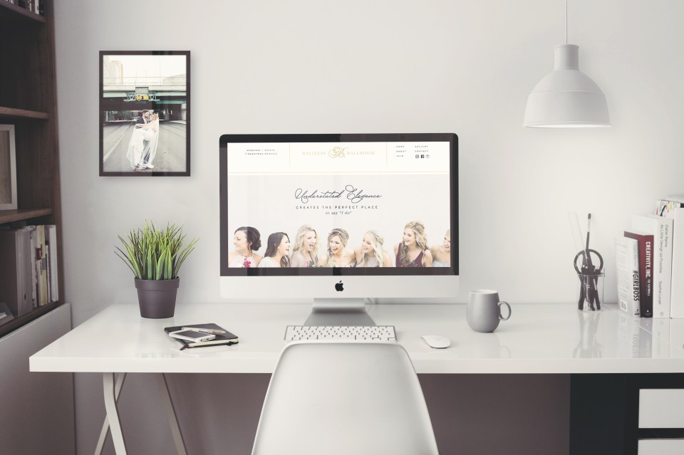
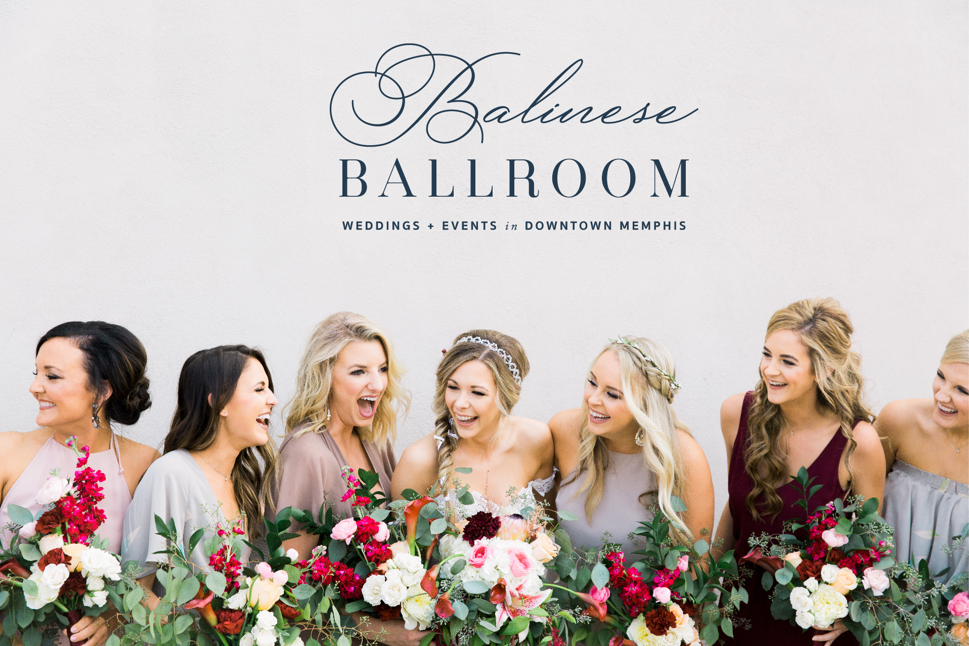
Balinese Ballroom is a beautiful events venue in downtown Memphis, Tennessee. The venue itself is STUNNING! Interior brick walls, industrial yet elegant, and loads of natural character, this venue is a real dream for a bride who wants a luxurious and contemporary wedding.
When Balinese Ballroom came to me looking for a brand and website makeover, I was ECSTATIC! I love working with event and wedding industry businesses, and as someone who grew up an hour away from Memphis and frequented there, I felt a special connection to their business and clientele.
For being such a well-established Memphis company, Balinese Ballroom didn't have any logo or branding in place. Their old website was very dated and didn't showcase all that they have to offer. Our goal was to WOW that dream bride and create a space where she can visualize herself getting married in the venue and get any major questions or hesitations answered. We wanted to capture the industrial, urban and major sophistication that this venue offers - while still being SUPER FUN. Because who doesn't want their big day to feel like a party?


THE GOAL:
The goal of the branding was to create a feeling of sophistication and luxury while maintaining a more city vibe. We didn't want the brand to feel like the typical rustic farm venue. We wanted everything to stand out for what it is - an industrial type venue in the downtown of a major city. For the website, we utilized gorgeous photos and video clips to really showcase not only the gorgeous venue itself but also what it looks like when a real wedding is happening there. As a designer, I think this is often something event businesses miss. People usually don't want to see your venue empty and on its own. Sure some photos like that are needed, but in general, people NEED to be able to visualize themselves there. And in order to do that you need photos and videos of other people who have had events there!
Now, let's hear it for Ashton, the venue manager, so you can hear what she had to say about the Balinese Ballroom project!
Question: What’s your favorite part of your new brand and website?
Ashton: "Can I say everything?! Because everything! The color scheme is amazing, the fonts are beautiful, and the flow of everything is perfect! I have no doubt that we will be gaining a lot more business after brides see this site. It is aesthetically pleasing and I think it will appeal to everyone. Our site was in desperate need of TLC and Elizabeth completely turned it around for us. We are beyond excited!"
Question: How do you think this updated brand and website will impact your business?
Ashton: "I know this will drive more people to our business. If I had seen our old site while planning an event, I would not have trusted that we knew what we were doing. Now, it looks very professional and really showcases our beautiful venue. We really didn’t have branding before so everything that we would put out would have different fonts and color schemes. There wasn’t anything that defined and separated us. Thankfully we have that now and I know we will continue to grow from this."
Were you surprised by any part of the project?
Ashton: "I had seen several examples of Elizabeth’s work and loved it (hence, why we chose Speak Social Agency), but I wasn’t sure how it would all come together. I was pleasantly surprised how beautiful everything turned out! Our goals were accomplished and exceeded! We are beyond pleased with the final product!"


"I have no doubt that we will be gaining a lot more business after brides see this site."


