Calling all Showit users and business owners thinking about using Showit as your website builder. Showit rocks, and if you've been around here for a second, you probably know that I love Showit. My website is built on Showit, I sell Showit templates, and I'm a Showit Design Partner. I love Showit — plain and simple.
In my membership, Breakthrough Brand All Access, one of the members asked what cool Showit features I don't see people using enough or are underutilized, and we talked about it in our Facebook community and in a member Q&A. Still, her question inspired me to talk to you guys about this. So, I'm sharing 5 cool Showit features you may not know about that you should try on your website. These are features that I'm loving lately, and I think you will as well!
These cool Showit features and tips are for non-designers and designers alike. So if you're reading and thinking, "Well, that's cool, Elizabeth, but I'm not a designer." Fear not — you can edit your website for your non-designer business to do these things too. No need to hire a designer to set these cool features up!
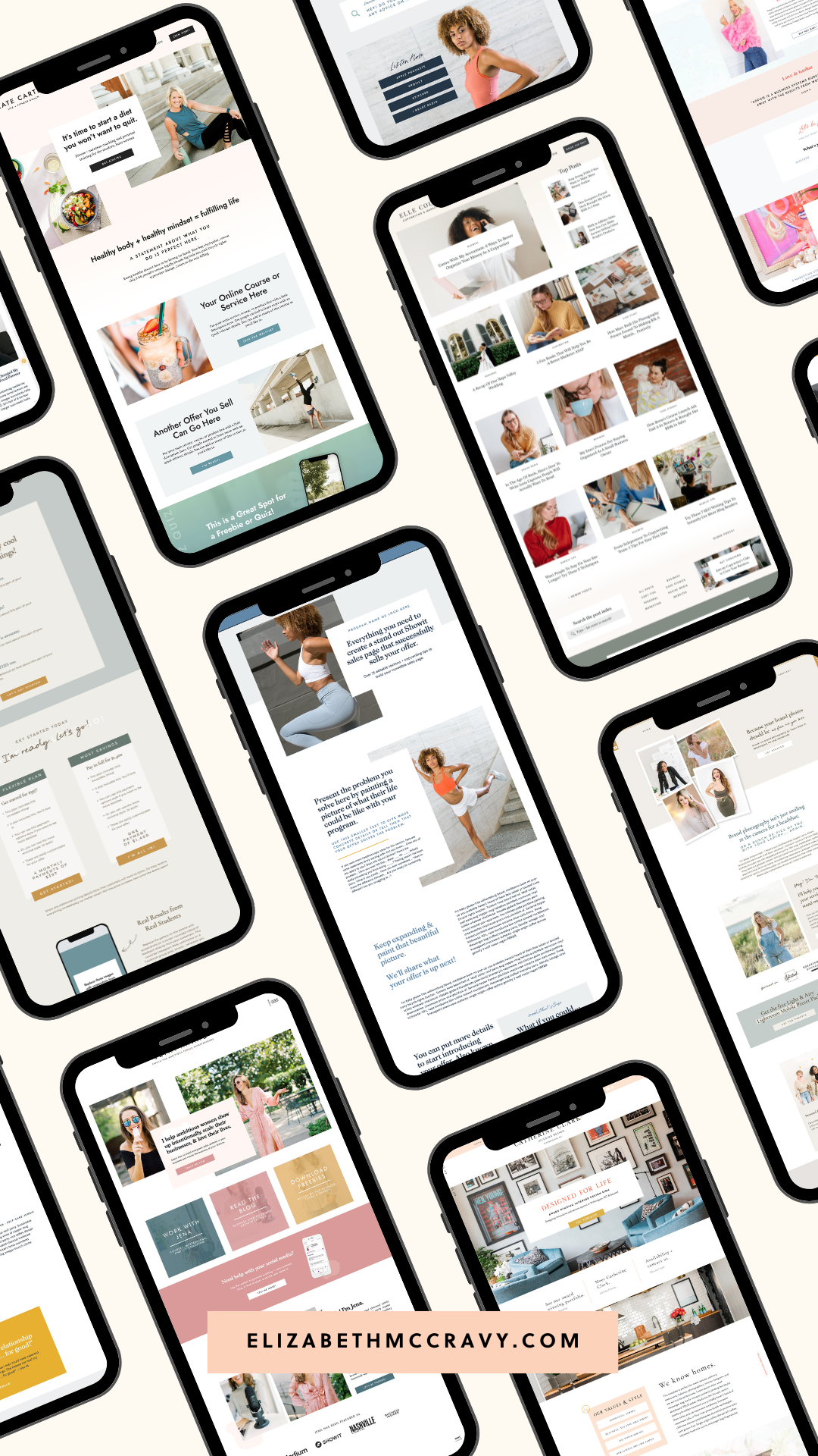
Want a Showit template that’s implementing these features? I just released a collection of Showit Sales Page templates that match our top-selling templates. No more piecing together a sales page based on another page of your site or struggling with what goes where on the sale page. I’ve got it all set up for you. These sales page templates have over 30 sections (called canvases in Showit) designed to guide you through creating an epically amazing, high-converting sales page for your online course, membership, coaching program, digital product, or whatever it is you’re launching.
The sales page templates also have copy prompts throughout to help you not just have designs that sell but WORDS that sell. I’ve brought the same strategy I use on my own sales pages to you in these templates. The new templates and all my other templates are 20% off right now to celebrate. Use code LABORDAY to shop + save!
What we're covering in this article:
- Use videos and animated GIFs as backgrounds on your website!
- Integrate canvases with the new gradient feature to fade the colors between canvases.
- Use the slide transition to set text to scroll over an area slowly.
- Embed stuff for a super integrated web experience for your clients/customers.
- Use Beaver Builder to write/build out your blog posts.
LISTEN TO THIS EPISODE NOW:
Subscribe & download the episode to your device: Apple Podcasts | Spotify | YouTube | iHeartRadio
Search for episode 174!
1. Use videos and animated GIFs as backgrounds on your website!
Showit has a built-in feature that allows you to put a video as a background on a canvas on your website. The video has to be under 30 seconds, have no volume, and be under 8MB. All of that being met, this looks incredible. You can have text over it, do parallax or have it scroll with the page; so many options — all on the desktop side.
You can't do videos on mobile. However, you can use animated GIFs to resemble videos on your mobile site in order to get that effect. You'll want it to be a shorter video with a smaller file, but to the user, it looks the same! I have a video on how to do this in my Showit Blueprint course that comes with all template purchases.
Using video on your website is a sure-fire way to engage viewers. Video is so hot in website design because of things like Instagram Reels and TikTok. Regarding your website, I'm referring to any form of 'movement' in place of an image as a video, which is why a short clip on a GIF is included.
Having even one video on your site can help your website strategy by improving SEO [source here]. It can also increase time spent on your site and improve your Google ranking because they prioritize sites that use video. Research conducted by Mist Media found that "The average internet user spends 88% more time on a website that includes video content." Another study by Brafton reported that "Viewers stay on a website six times longer if the site includes video." [source here]
Besides all of that, video looks cool, and it's modern; it's engaging, and it makes things feel fresh. You might be thinking, "How am I supposed to use video? I don't have the money/time to hire a videographer. I don't have any professional branded videos."
There are two things I want to tell you to help you create videos for your website. The first is to use your iPhone to create videos. You don't need professional videography work, especially for these types of videos. They are short and will be put on a loop on your site. The second is to use stock videos! I tend to use stock videos more than anything!
One site I love for free stock videos is Pexels. They have so many free stock videos and images. This is the site I use for the videos in my templates. In addition, you can search Pexel for a variety of topics and find fabulous videos that integrate well into your brand. For example, check out the Kate, Elle, Taylor, and Gabby templates from my shop to see background videos in action! You can find all the templates here!
2. Integrate canvases with the new gradient feature to fade the colors between canvases.
Showit has been rolling out all sorts of updates lately. A cool Showit feature you'll see now in your account is grid snapping to help align everything on your site! I got the chance to see this at the Showit designer retreat.
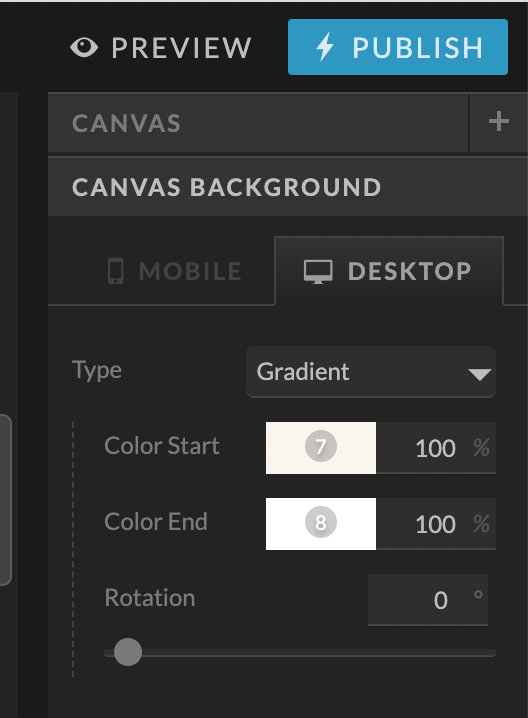
One of my favorite new additions is the gradient feature for canvases. Within Showit, you can make a section of your site fade from one color to another. There are many ways to use this feature beyond two colors fading horizontally. I've loved using it to fade between canvases for a more integrated site that flows.
For example, instead of going from a light blue to a white canvas background, it will slightly fade to the new color in a seamless way. You can also use this feature over videos or photos with text. You can do this on mobile and desktop sites. If you want to see this in action beautifully, check out the Kate template here, it uses this new feature a ton!


3. Use the slide transition to set text to scroll over an area slowly.
Showit has all sorts of transitions built in for any objects you can make, from fading something in to sliding it out or bouncing it in and out. I love using transitions. However, you don't want to overdo it and overwhelm users.
You'll see me use these features on my templates, but very strategically, in a way that makes sense. One thing I love lately for my templates and my website is having text sliding slowly for high impact. Instead of just saying something, you can have it repeated across the page.
All you need to do is set your transition speed slower, and on a slide, type in the text you want to do this with on repeat. For example, it could be "coming soon" on repeat sliding slowly. Look at the coming soon pages on the Elle and Kate templates to see this in action. It is so fun and high-impact.


4. Embed stuff for a super integrated web experience for your clients/customers.
You could have your call scheduler, intake form, and payment page open in a new window. Or, you can EMBED stuff from outside sites directly into Showit; no coding required. This will create an integrated user experience, so they don't have to leave your website.
This link is also much easier for you to remember. So instead of linking to your call scheduler, you can embed Calendly for easy access without remembering any complicated links. I've been doing this since I started using Showit.
Some other pages I'd consider doing this on:
- Waitlist application - embed a form from Dubsado or Honeybook
- Call schedule for your group program - embed the schedule
- Opt-in form from FloDesk — embed it instead of opening it in a new FloDesk site window.
Most of my templates have a call scheduling page already designed and ready for you. If you're trying to get your website up quickly and feel stressed about getting a bunch of things done, this is something that can wait. It's worth doing, but it doesn't have to be done before launch. Again, it's easier on you because you will always know the link, and it's easier on your clients and creates a more integrated experience.


5. Use Beaver Builder to write/build out your blog posts.
I think I'm one of the only Showit designers talking about Beaver Builder. It's like my best-kept secret, honestly. I love it. It's a page builder for WordPress that I specifically use for my BLOG.
I do not use it for my website pages because those are in Showit, but for blog posts. Beaver Builder allows you to design the layout of your blog in Showit. Then when it comes to putting in all the content, you're using Beaver Builder to lay it out.
It's a drag-and-drop builder that is far more intuitive than WordPress's native blog builder. The caveat here is that you need the advanced subscription of Showit to use the Beaver Builder plugin. The plugin itself is free. There are paid options, but they are not necessary here. I have videos on blogging with Beaver Builder in my Showit blueprint course. If you're a customer of mine, you have access to these videos, and it's worth checking out!
[For even more cool WordPress plugins to try with Showit, check out this blog post for my 7 favorites.]
Are you thinking about trying Showit for the first time? Click here to get one month of your Showit subscription absolutely free!


To recap:
- Use videos and animated GIFs as backgrounds on your website!
- Integrate canvases with the new gradient feature to fade the colors between canvases.
- Use the slide transition to set text to scroll over an area slowly.
- Embed stuff for a super integrated web experience for your clients/customers.
- Use Beaver Builder to write/build out your blog posts.
So, that's 5 cool Showit features you should try on your site! I hope this was super helpful for you! Share this with other Showit users who would love to learn about these cool features. Let me know over on Instagram which one of these you're going to try and which one was new to you!
If this article was helpful for you, check out my EM Shop templates here. They are integrating all the things I mentioned in this article FOR YOU. You can do it all naturally because it's built into the templates. I hope to see you with an EM Shop template soon!


